From the Screen to the Streets.
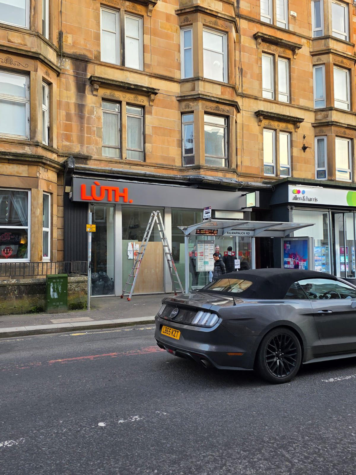
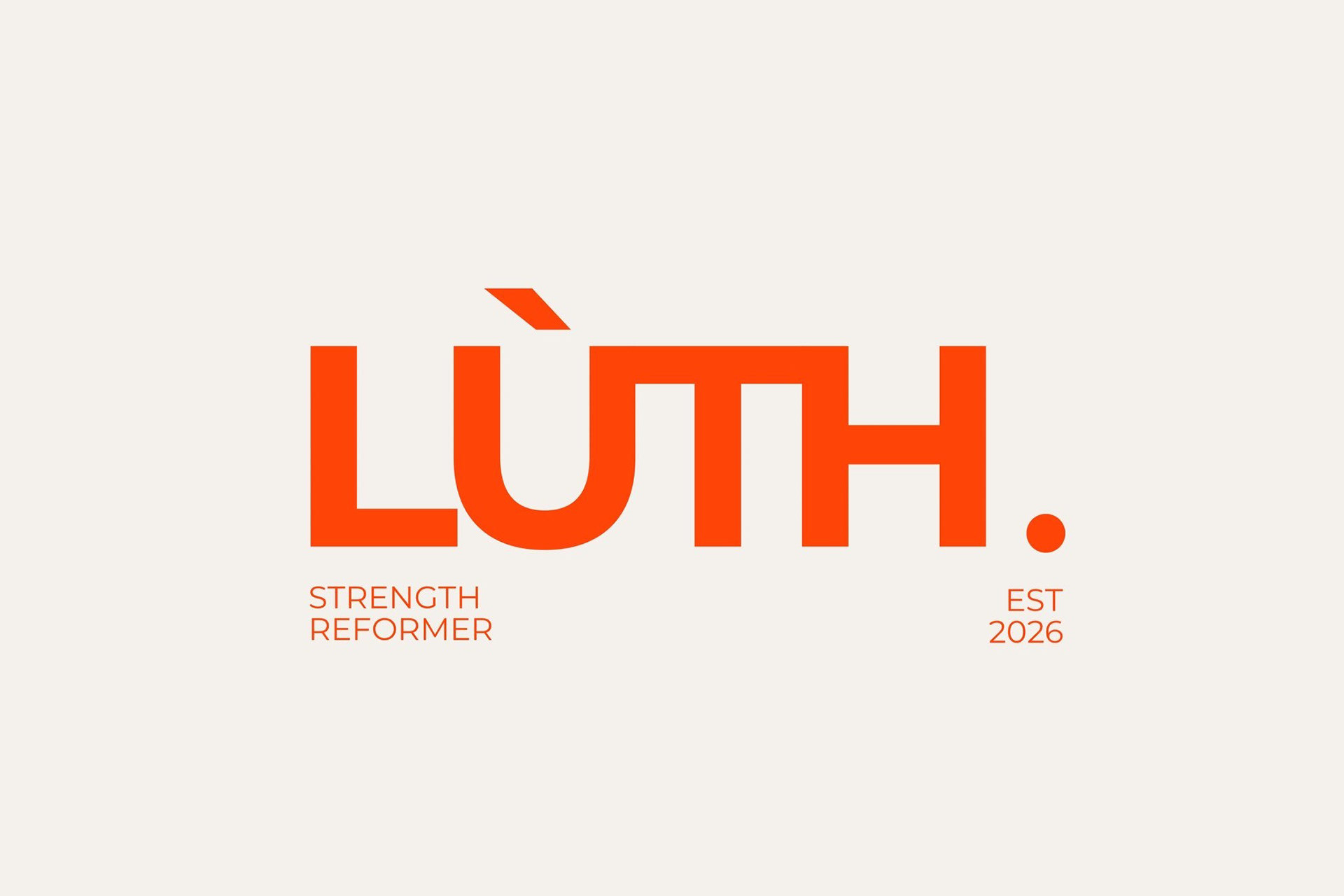
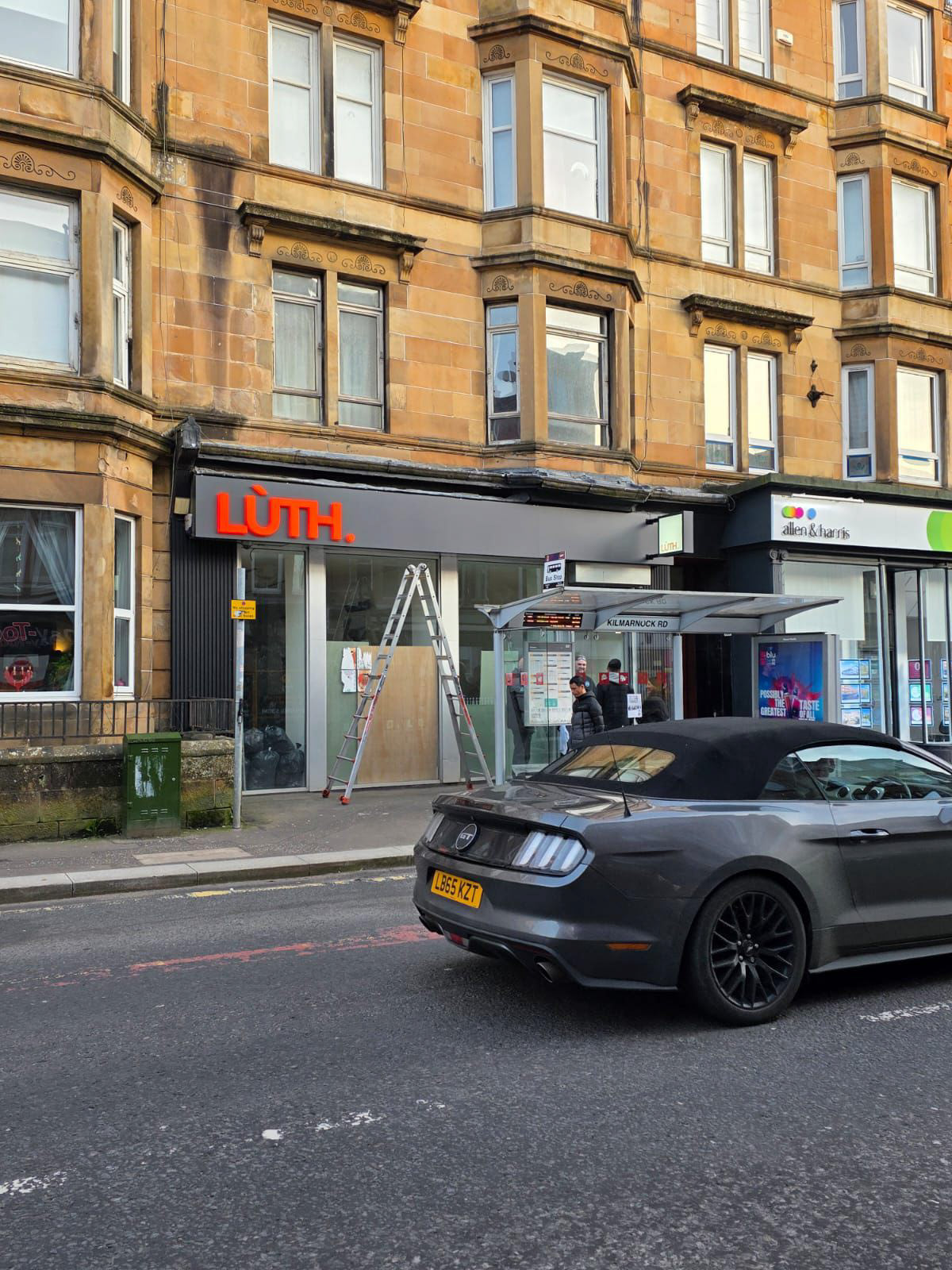
LÙTH is a new strength-focussed reformer pilates studio which opened in Shawlands, Glasgow in 2026. Owners, Emma & Gary, reached out ahead of opening for help converting their new logo into bold, eye-catching signage.
I designed an interior and exterior signage package from their existing logo file, developing a visual identity and materials palette as well as adapting the logo for physical production.
I worked with the client from initial contact, through concepts, to manufacture and installation of new signage.
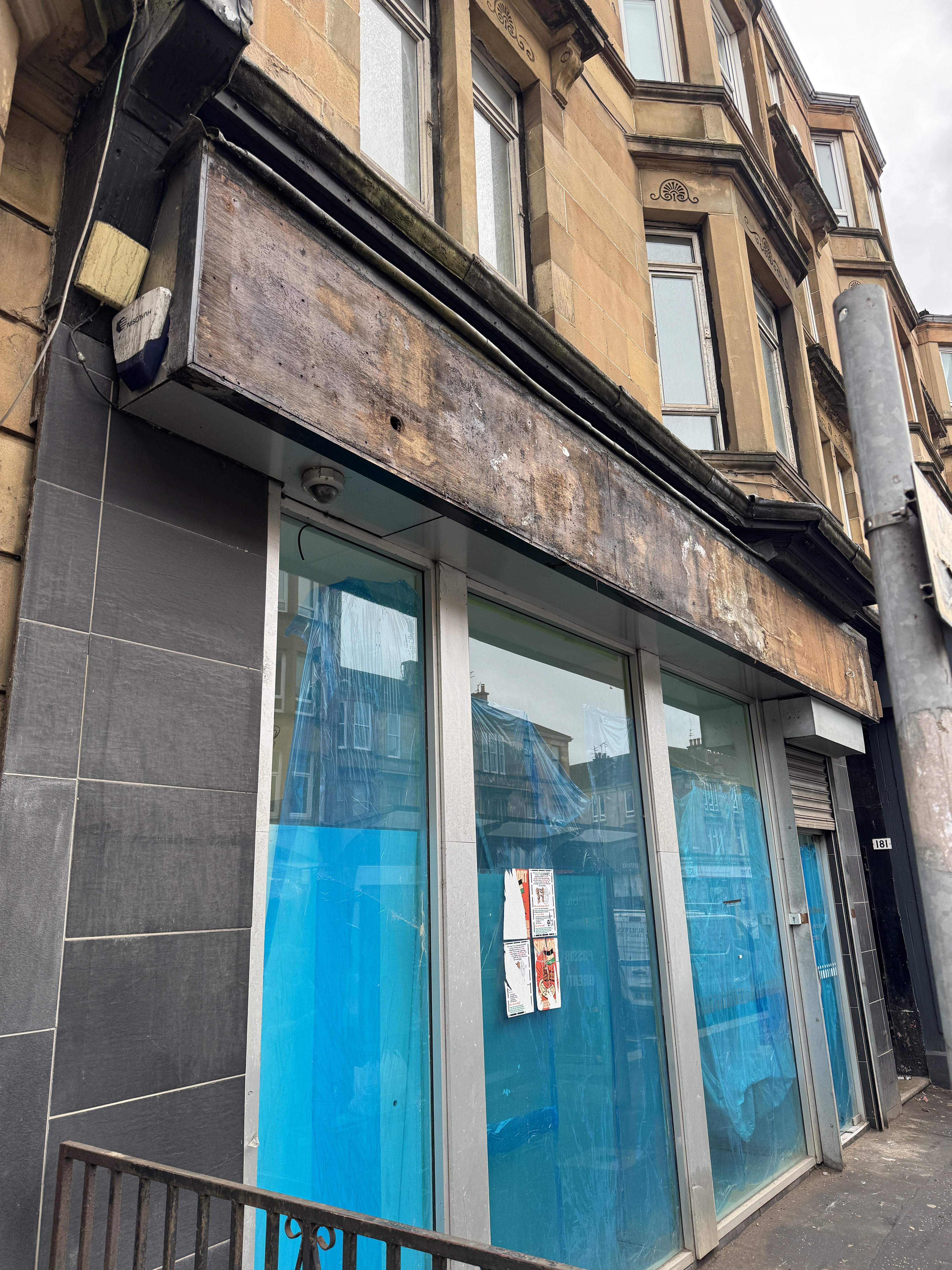
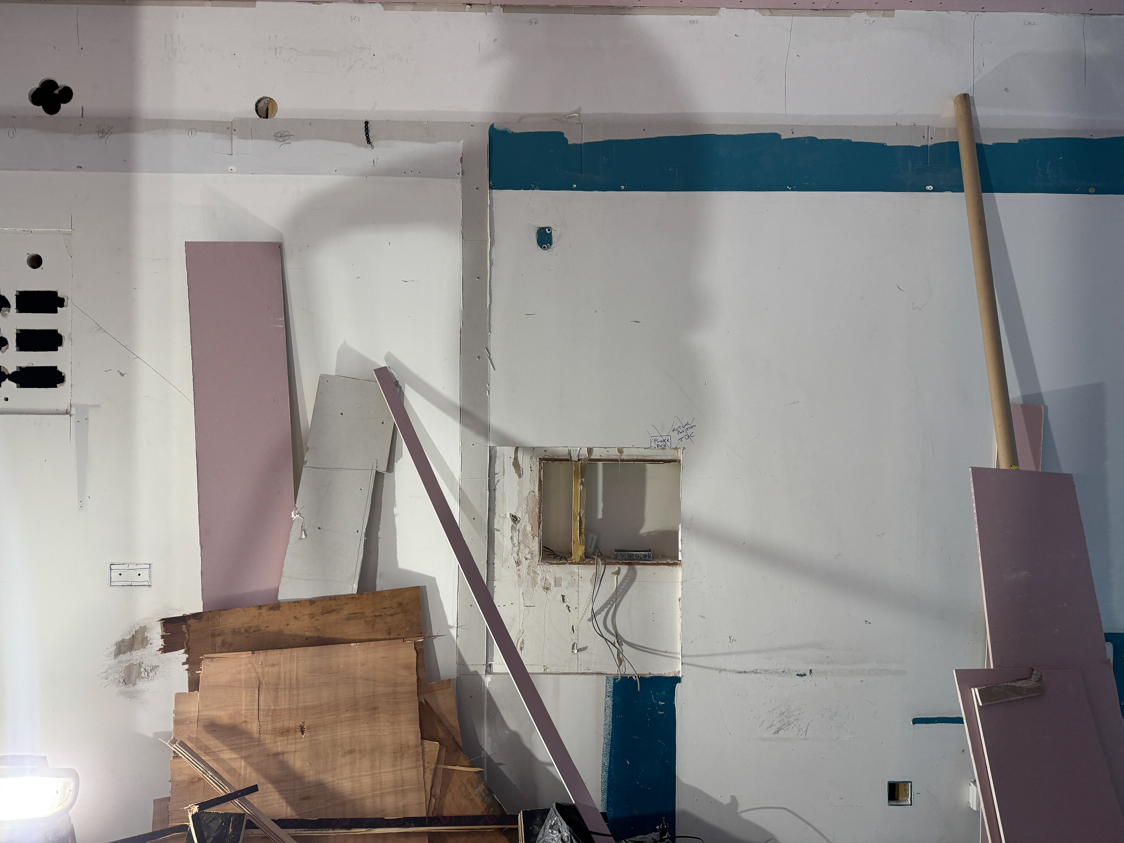
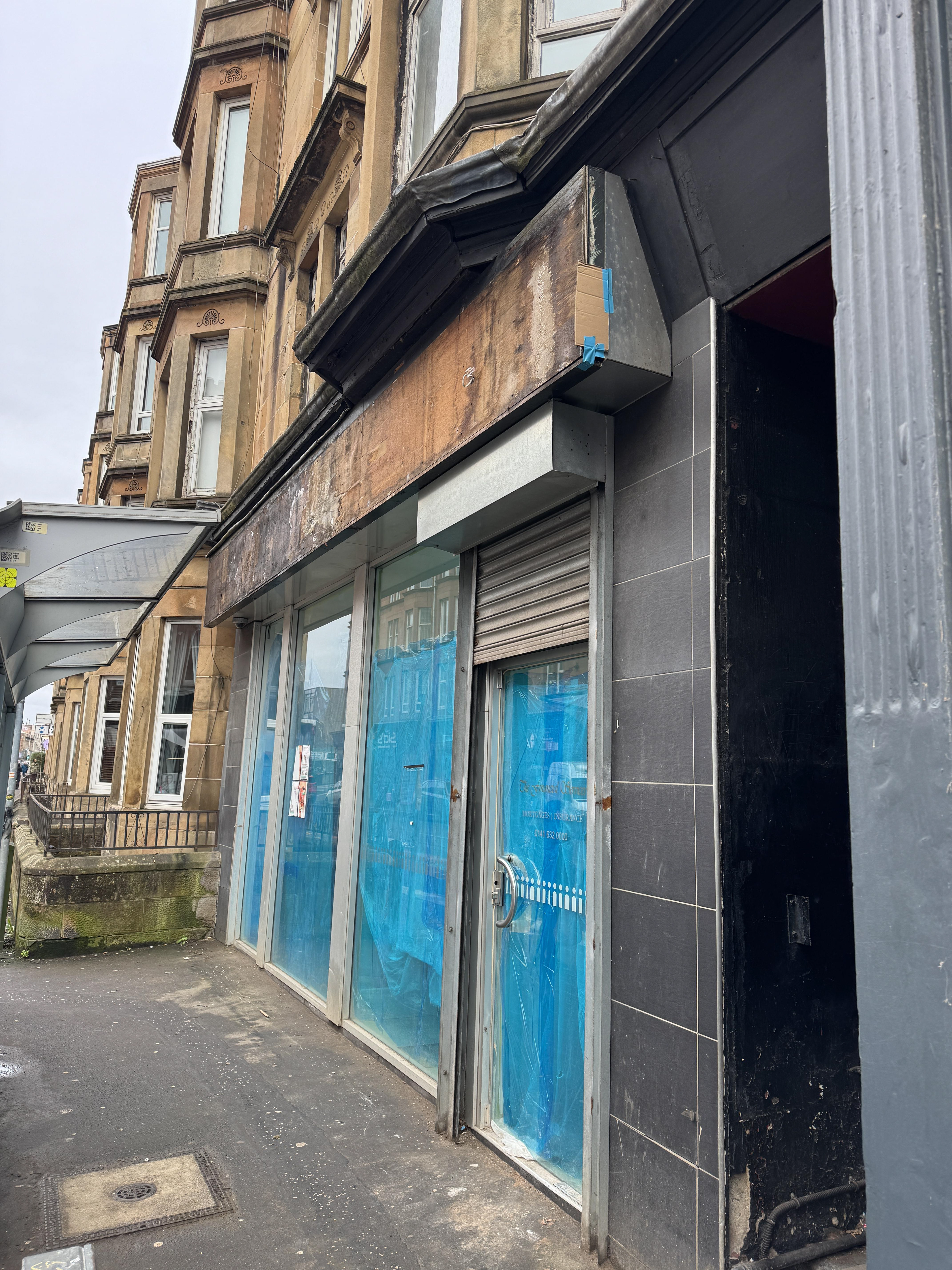
The Challenge
The client only had one file – a jpeg of their new logo. That meant no vector files, brand guidelines or additional assets for guidance. It was important that every design and material choice would positively build on LÙTH's visual identity with cohesion and intentionality.
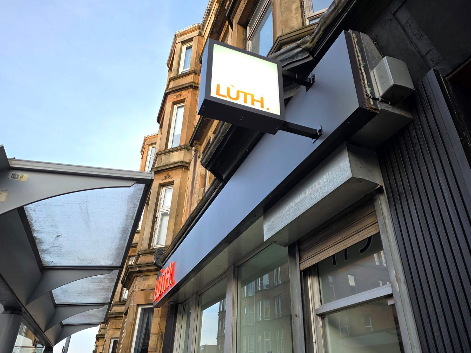
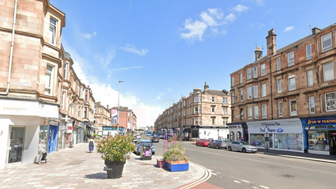
Over the last few years the Shawlands area has shifted into a trendy, high-demand area. To keep up with growing interest, the owners wanted to incorporate illumination into their main exterior sign, to stay visible and present in the evening and winter months.
Material & Design Decisions
With such a striking logo as a starting point, I knew that colour and material would be the keys to successful signage.
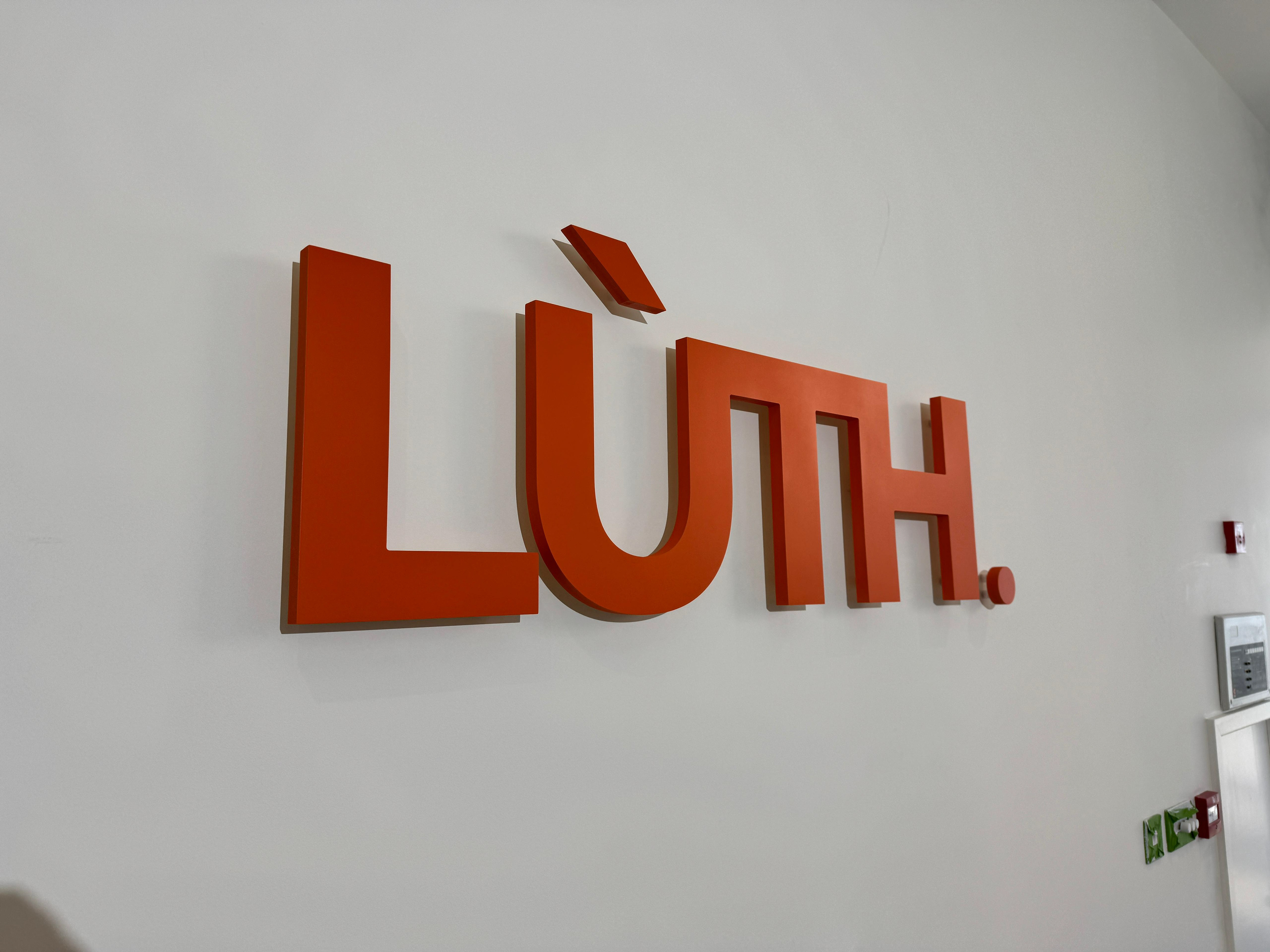
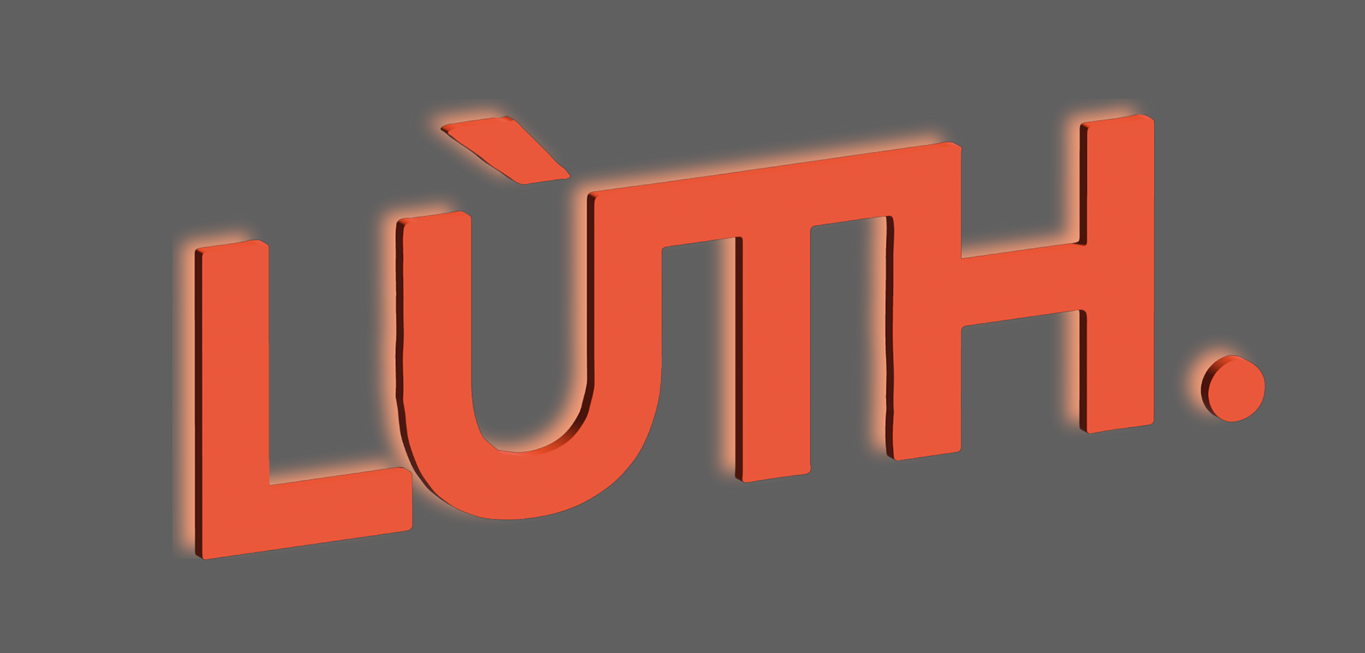
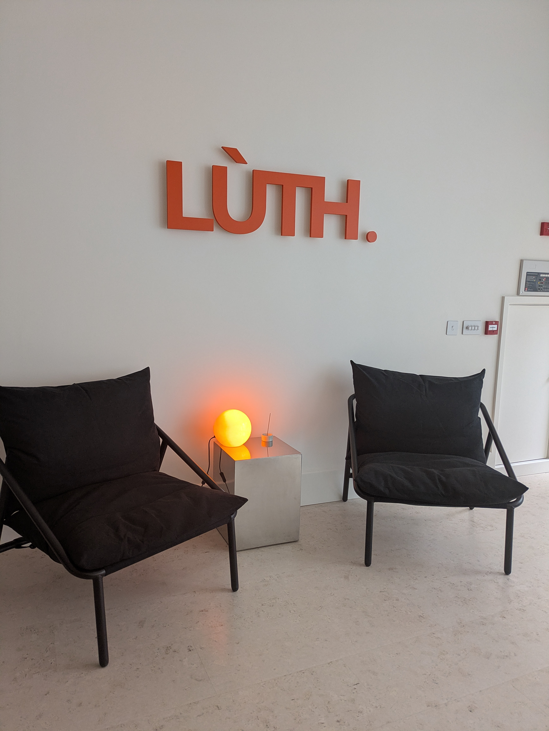
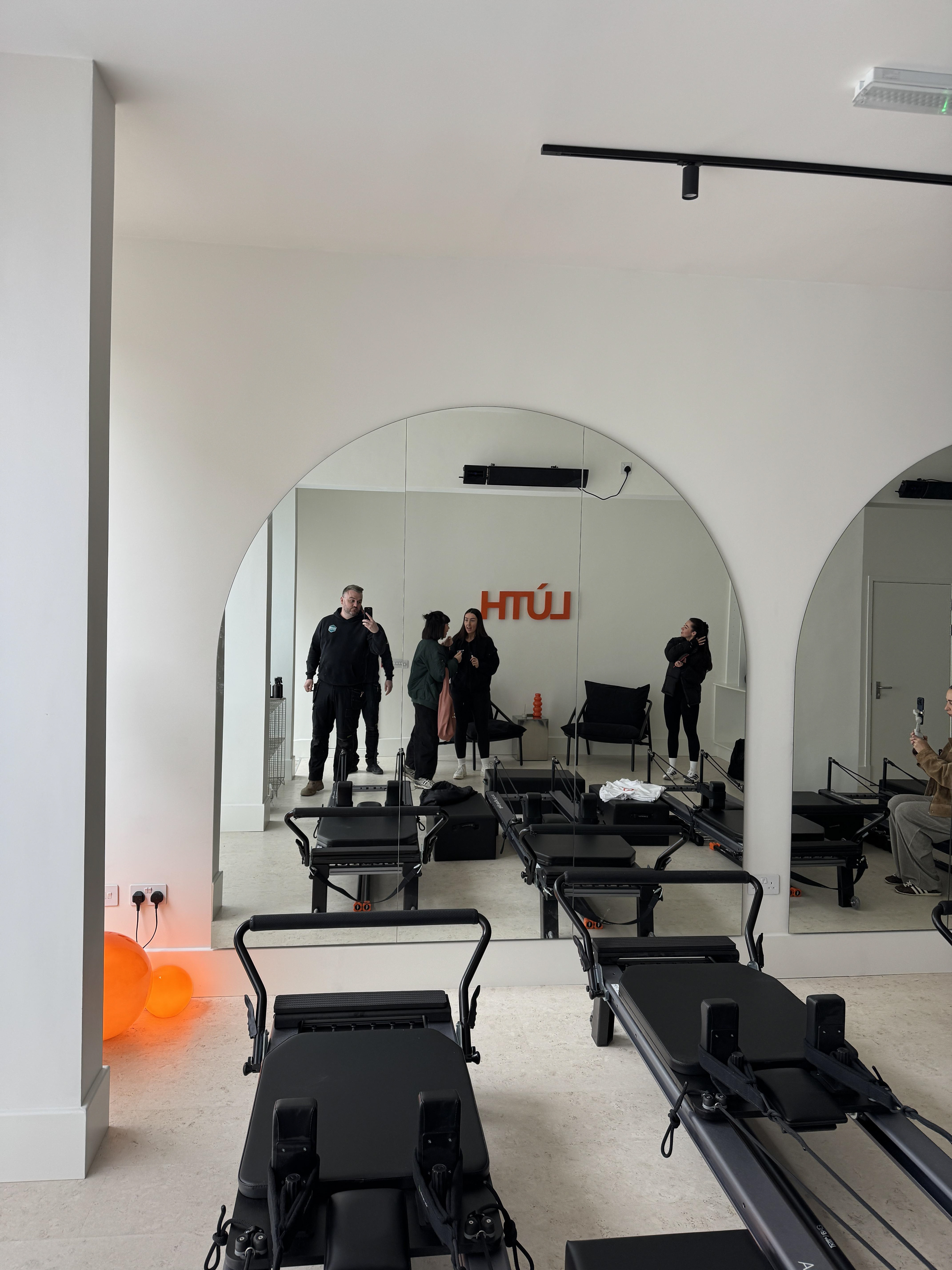
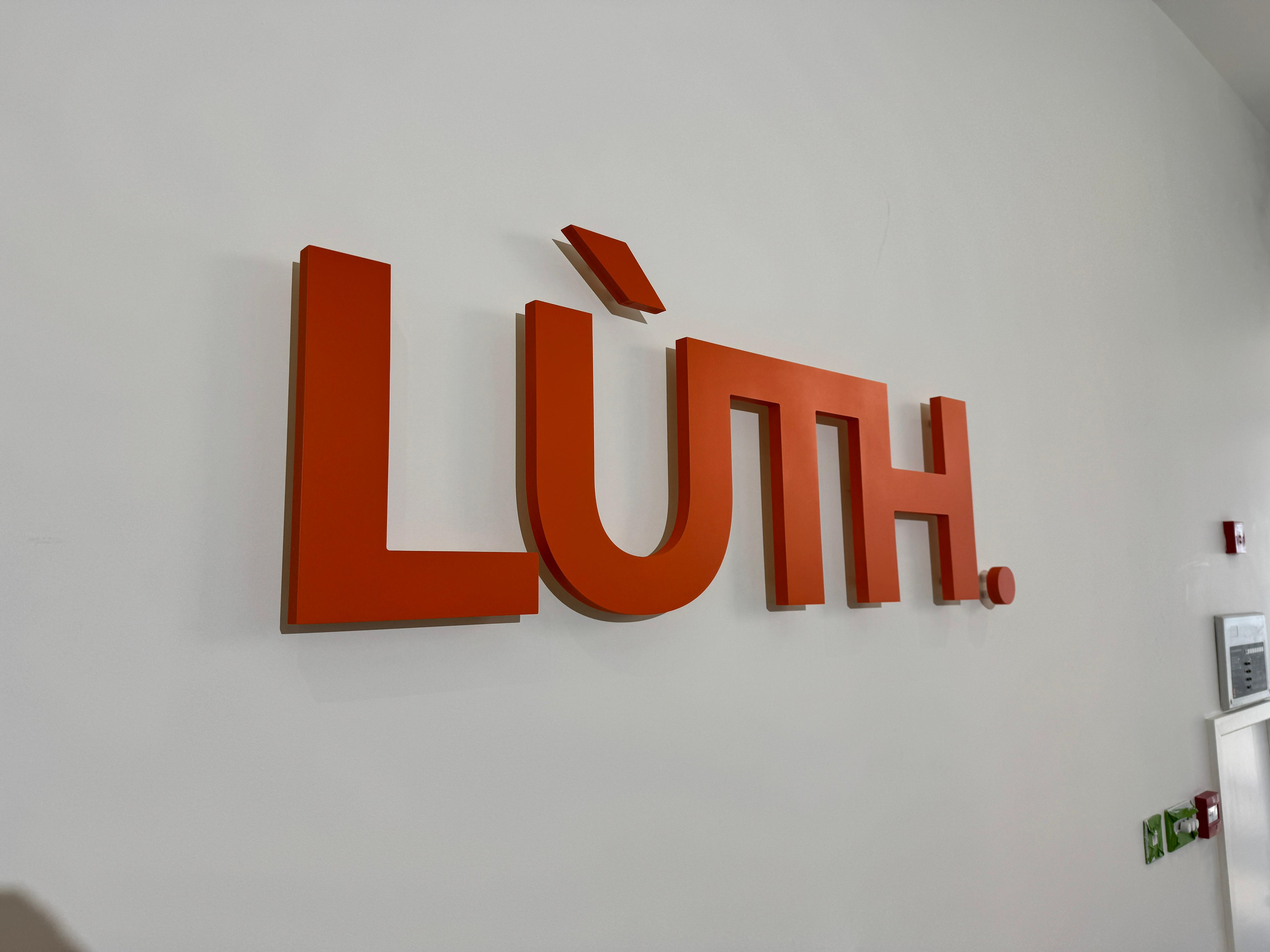
For the LÙTH text itself, I faithfully recreated this in vector format for scalability and chose RAL 2009 Traffic Orange as a matching paint colour. This got a protective matte lacquered finish.
I selected a chunky 19mm thick foam composite material for the lettering inside and out - Substantial enough to cast shadows or house LEDs.
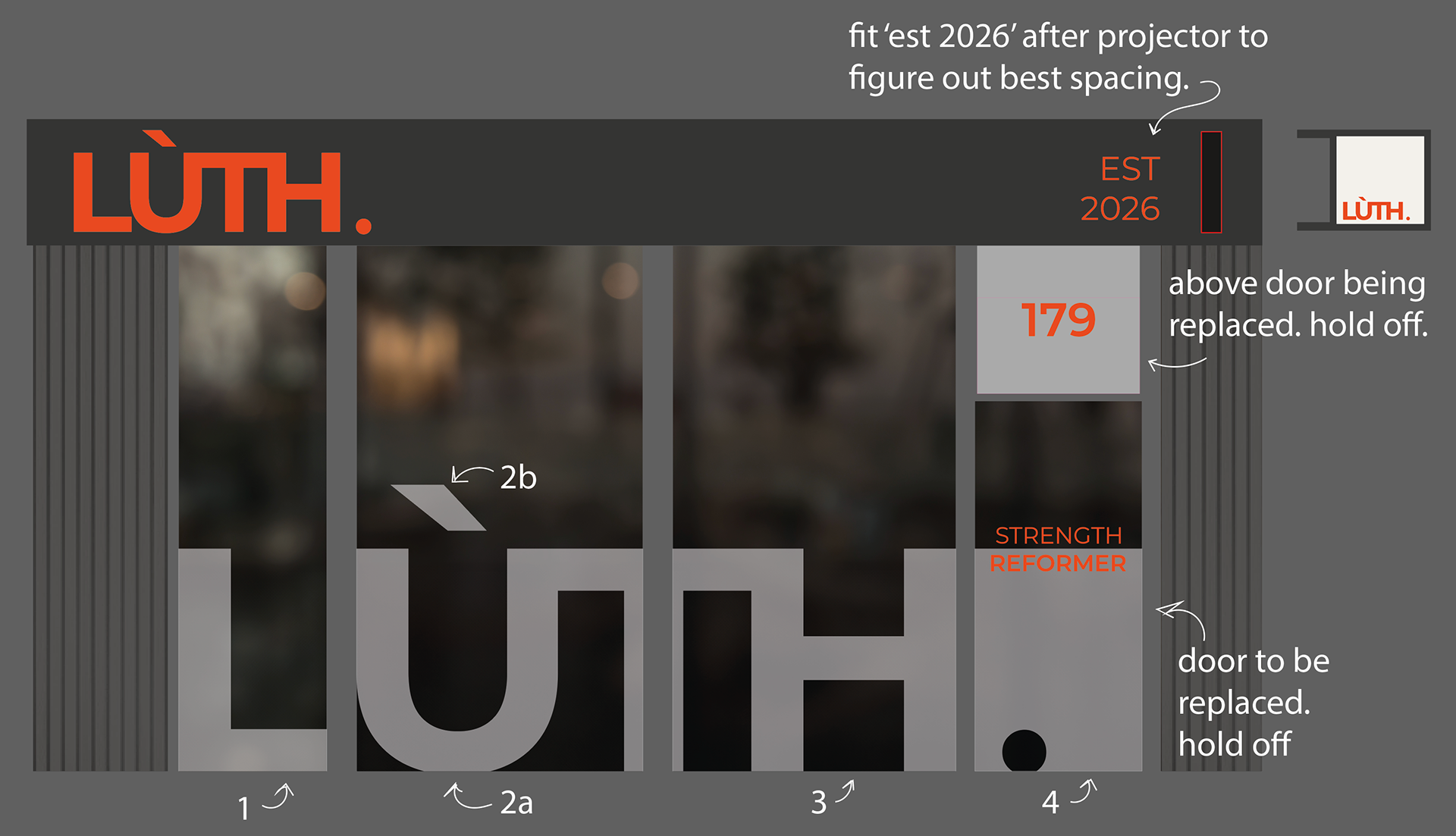
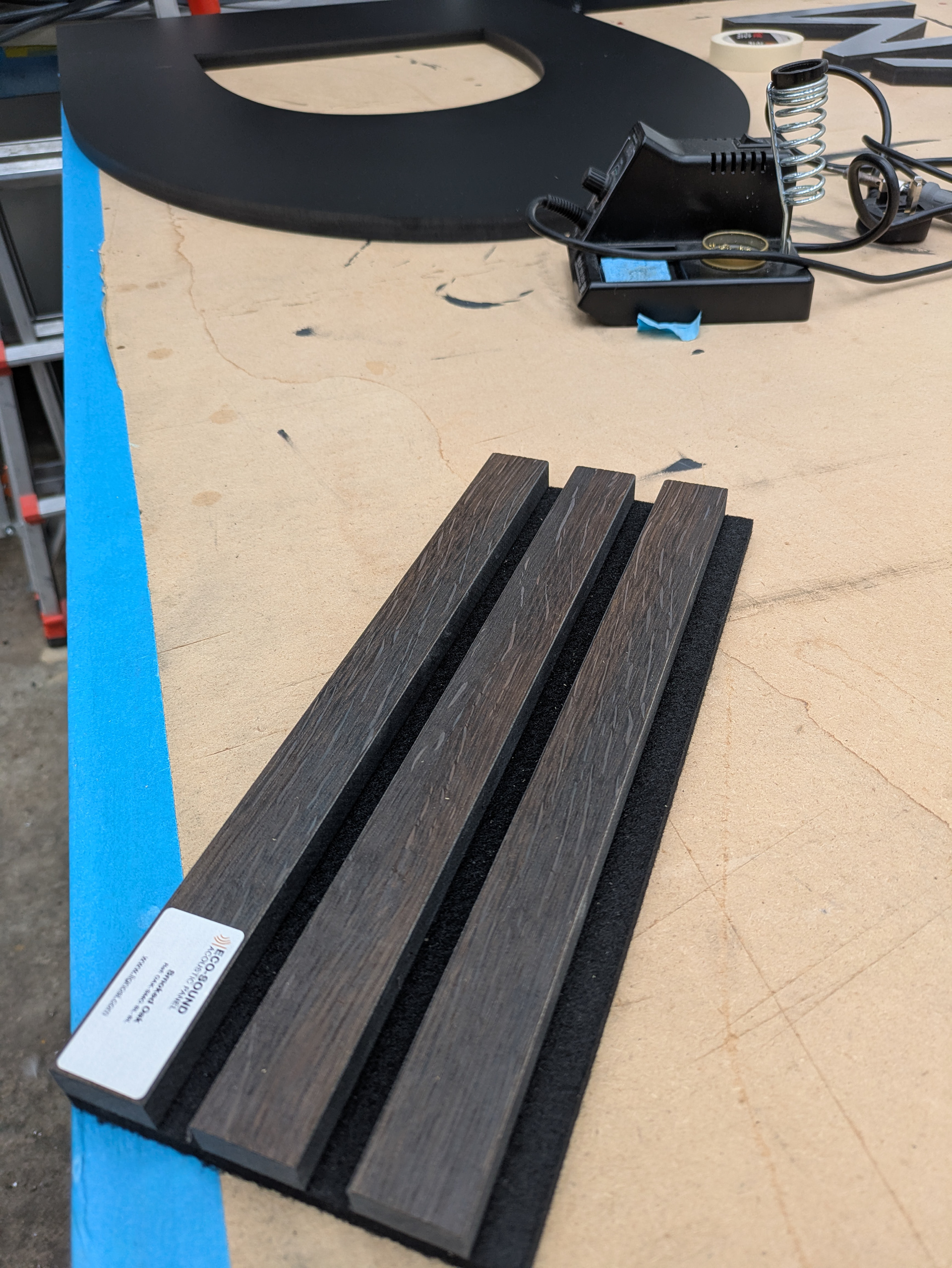
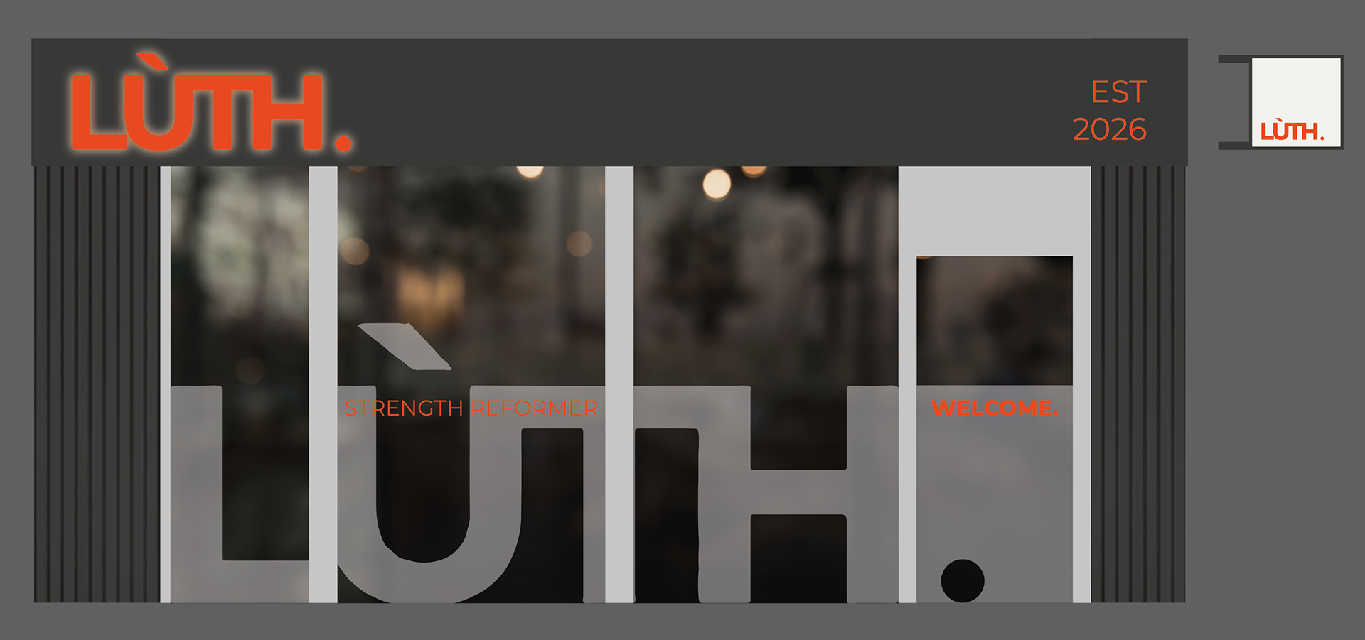
For the rest of the fascia, I chose a matte RAL 7016 Anthracite aluminium composite for the back-tray. I felt this would provide some much needed contrast against the lettering, while avoiding the complete darkness of black. To compliment this I chose dark wooden cladding to add some texture to the lower level of the shop.
Developing the Details
To compliment the bold main lettering, I designed some tasteful secondary signage.
Firstly, the custom window frosting design which replicated the logo design across the windows and door. By using negative space and partial frosting, we are able to draw the eye of passers-by and invite them to check out what's happening inside.
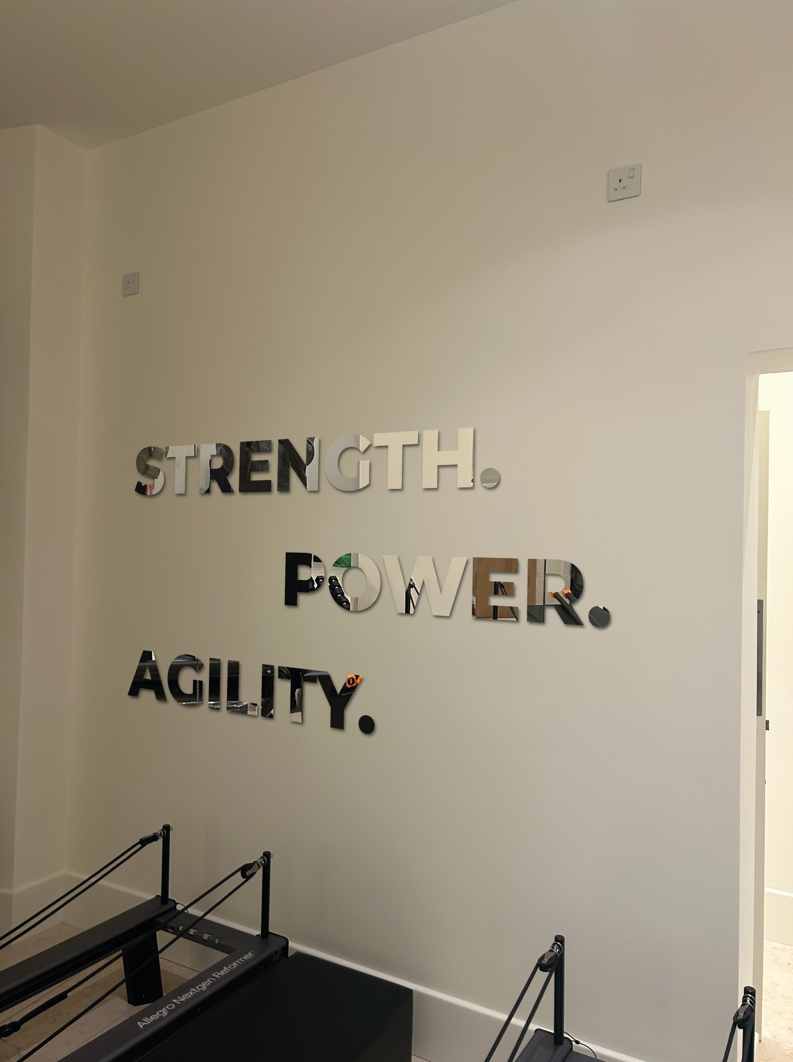
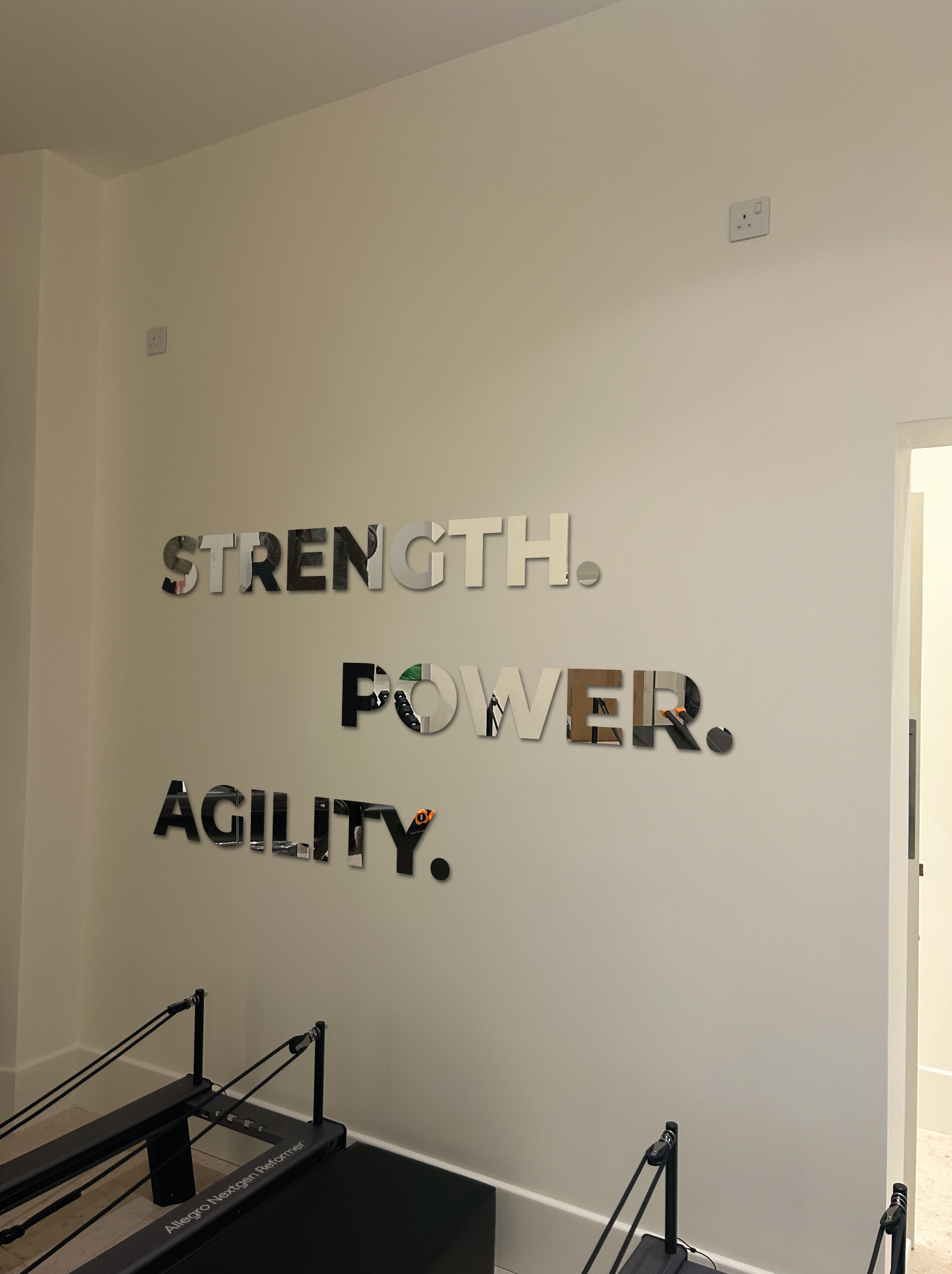
Elsewhere inside, we designed custom mirror finish lettering displaying a new slogan. This serves to inject some more brand identity and visual interest into the space, while also reflecting the natural light and making the space feel better. Best of both worlds!
My Contribution
Creative:
While I didn't design the logo itself, I was proud to adapt it and expand upon the visual identity of the brand.
I designed other brand elements, such as the slogans and other text elements to exist harmoniously alongside the main lettering.
Technical:
Key to production was the element of illuminating the exterior sign. I checked and adapted the logo where needed to allow for inlaid LED strips and mounting fixings to be installed with no visible wiring or fixings - Achieving the glowing and floating final look.
I fully prepared production files for this entire project. This included CNC cut files for lettering and trays in multiple segments, printed vinyl and cut frosting files, fitting templates and installation guides for my team.
Problem Solving:
I made informed choices of the signage materials required, including 19mm foamex for the lettering. 19mm was the ideal material in my experience due to its substantial thickness - a natural fit for this logo - and CNC compatibility, making it perfect to router out hidden channels for house fixings, electricals and LEDs.
With the vibrant orange colour being so key to this design, a close colour match was important to nail. For this reason, I selected appropriate paint matches from the standardised RAL classic colour system, as this is often creates a more accurate and vibrant colour than possible in CMYK printed vinyl.
Collaboration:
I was the primary point of contact with Emma & Gary for the whole project. From initial enquiry through concepts, design tweaks, pricing and production - All the way to coordination and completion of the installation.
I worked closely with my internal team of surveyors, manufacturers and fitters to ensure a smooth and unproblematic process of manufacture and installation.
Results